

Guaranty Building
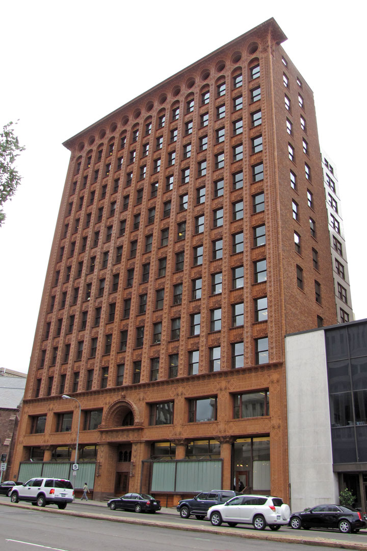
Guaranty Building
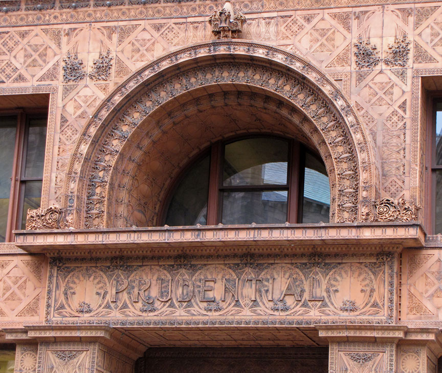
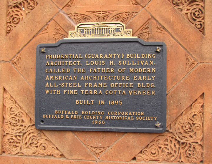
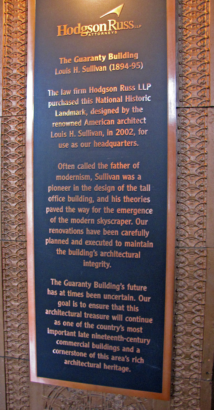
The Guaranty Building, which is now called the Prudential Building, was designed by Louis Sullivan and Dankmar Adler, and built in Buffalo, New York.
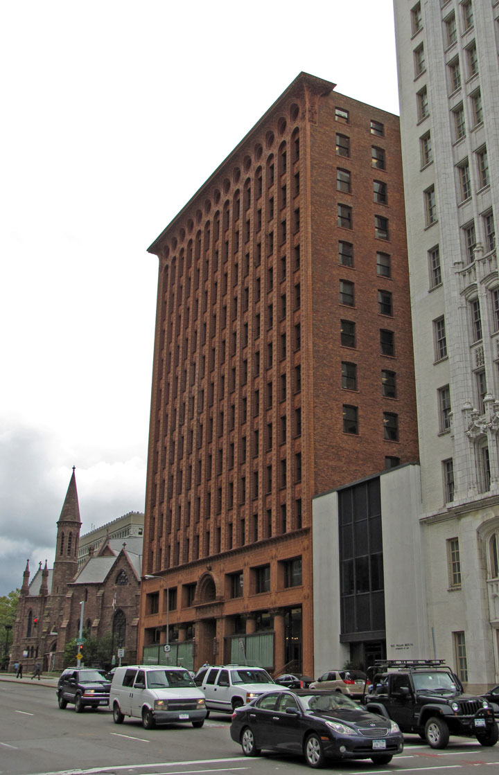
Sullivan's design for the building was based on his belief that "form follows
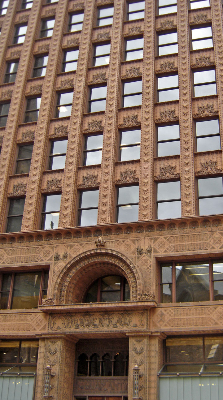
function". He and Adler divided the building into four zones. The basement was
the mechanical and utility area. Since this level was below ground, it did not
show on the face of the building. The next zone was the ground-floor zone which
was the public areas for street-facing shops, public entrances and lobbies. The
third zone was the office floors with identical office cells clustered around
the central elevator shafts. The final zone was the terminating zone, consisting
of elevator equipment, utilities and a few offices.
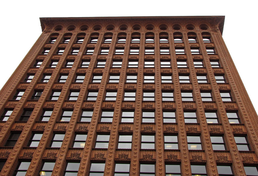
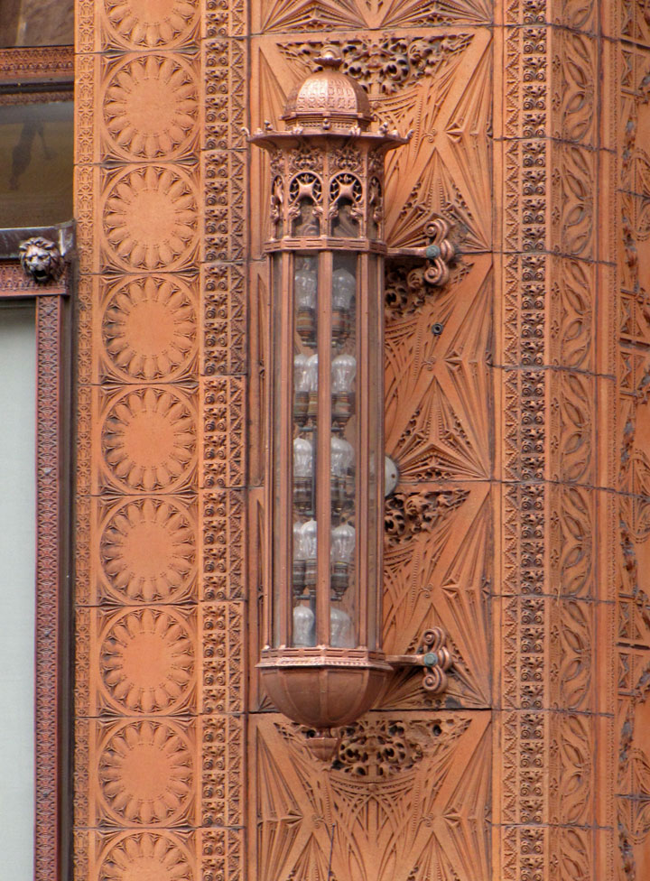
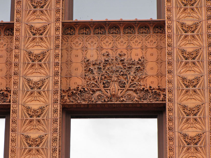
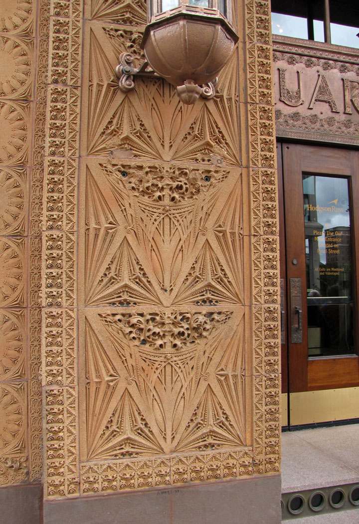
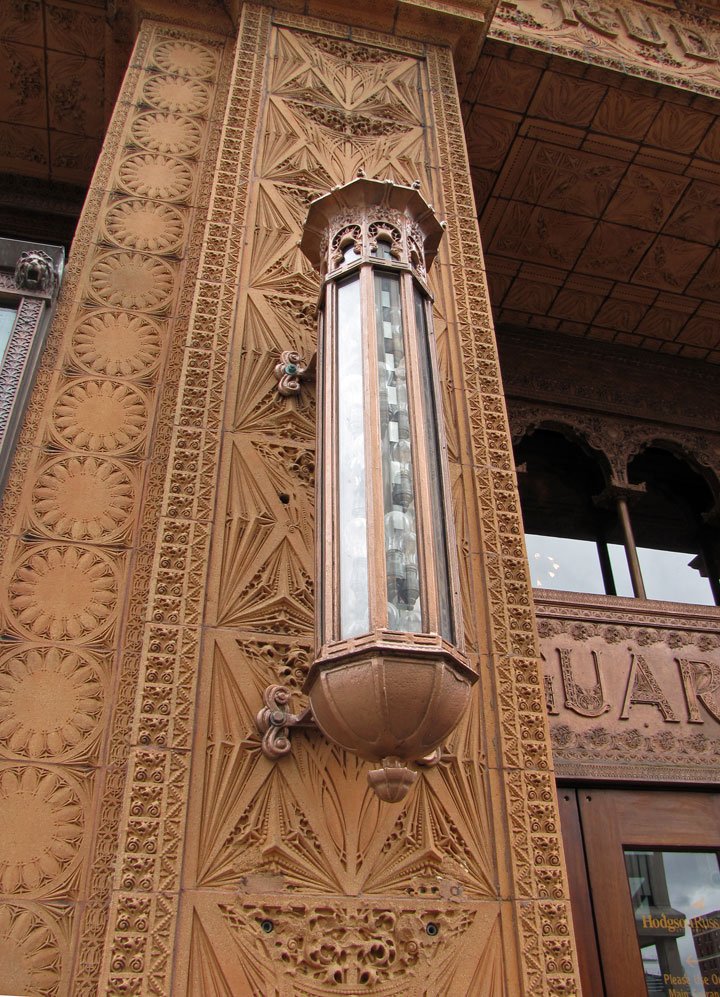
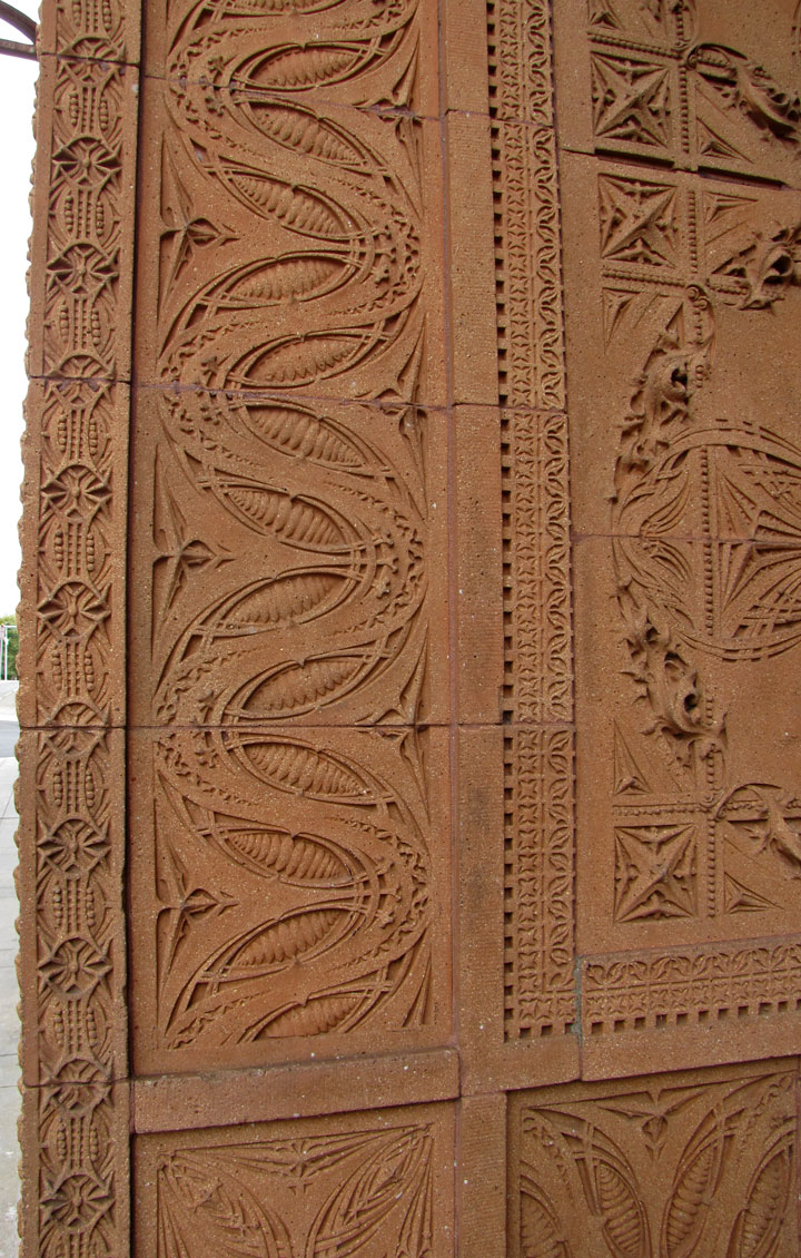
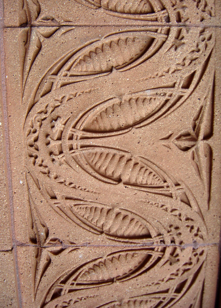
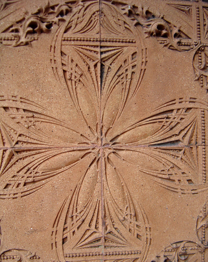
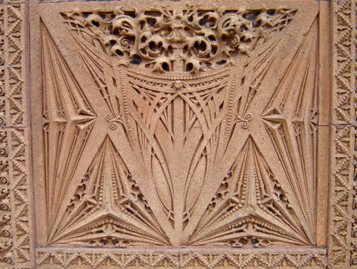
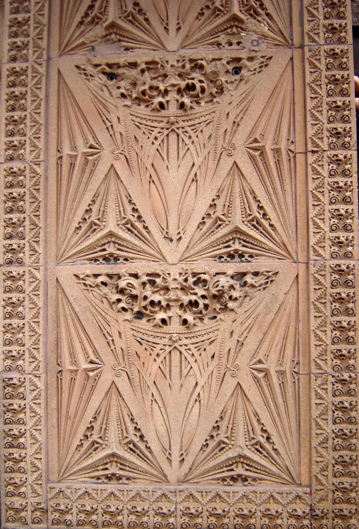
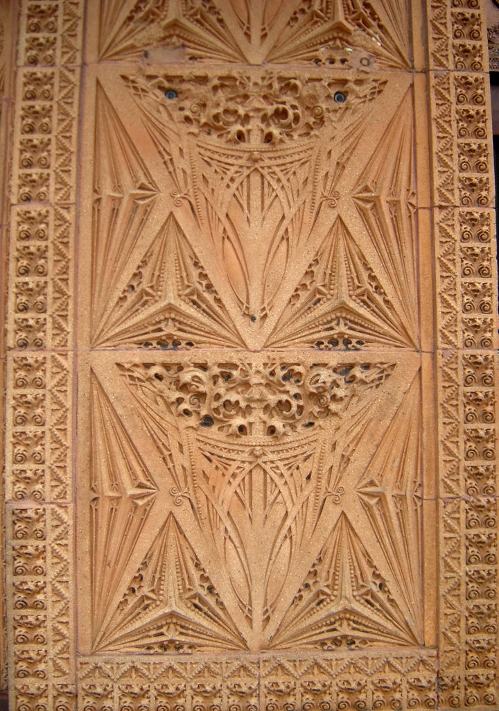
The supporting steel structure of the building was embellished with terra cotta
blocks. Different styles of block delineated the three visible zones of the
building. Sullivan was quoted as saying, "It must be every inch a proud and
soaring thing, rising in sheer exultation that from bottom to top it is a unit
without a single dissenting line."
The Guaranty was never meant to be the Guaranty Building. It was the brainchild
of a Buffalonian businessman Hascal T. Taylor to construct a speculative office
building in the developing downtown district called “The Taylor Building.” The
untimely demise of Mr. Taylor as the project was reaching its apogee resulted in
the Guaranty Construction Company, having been contracted to construct the
structure, determining to take on the project alone. Although “The entrepreneur
Hascal T. Taylor intended this building to be a monument to himself,” the
eventual monument would symbolize Sullivan’s achievements much more than its
creators.
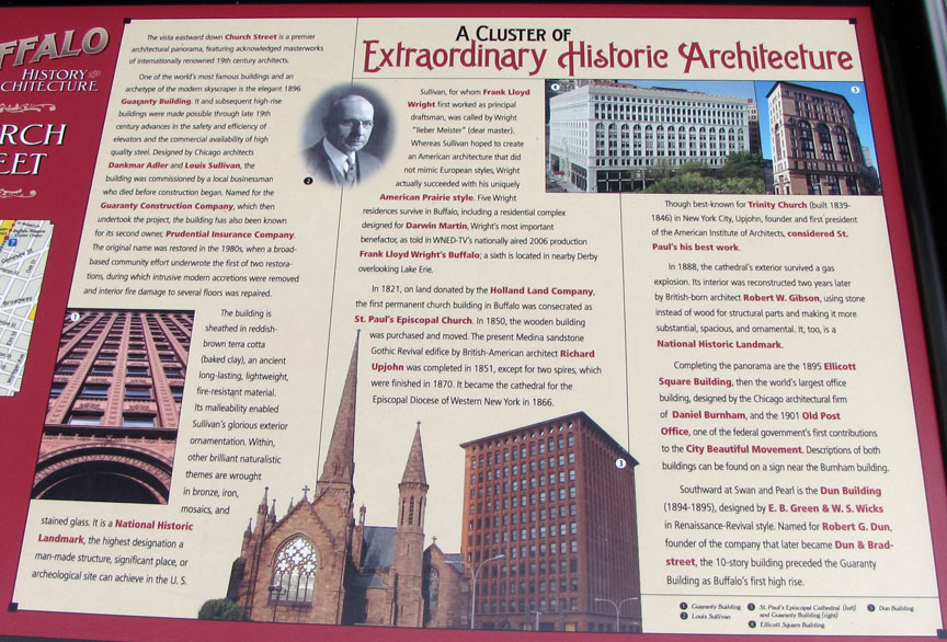
The site Taylor chose for his speculative office building was strategically located adjacent to the then County and City Municipal building as well as near a number of institutional structures. The intention was to attract high quality tenants such as lawyers through proximity, desirable amenities and the captivating design of an avant garde architect like Sullivan.
The Guaranty Building was not alone among major private building projects in
Buffalo at the time. Two blocks away, the
Ellicott Square Building was being
built to be the largest retail building in the world. This structure, extant
today exhibits an alternate exploration in the possibilities of new commercial
urban architecture by Charles Atwood and Daniel Burnham. As Buffalo’s downtown
rose above Lake Erie, further feats of engineering were securing the future of
the city and the built environment. Although earlier attempts had harnessed the
power of nearby Niagara Falls, it was just after the Guaranty building was
constructed in 1896 that the power was sent to Buffalo, illuminating the city
with hydro-electricity.
Buffalo’s rise to prominence in the built environment was matched in the political. As the Guaranty building was being drafted, Grover Cleveland was re-elected 22nd president of the United States. A former Erie County Sherriff, Cleveland had risen meteorically to mayor of Buffalo, governor of New York and then the presidency within five years. His platform of reform against entrenched political machines, bossism, and patronage was desperately needed, especially in major urban centers such as New York and Chicago. Cleveland’s fiscal policies had resulted in his loss of the presidency in 1884, but the results of Benjamin Harrison’s interim term brought him back to the office in 1892. Curiously the panic of 1893 which ultimately destroyed the firm of Adler & Sullivan had destroyed Cleveland’s first presidential term, but also resulted in Cleveland’s return to office and the final commission of Adler & Sullivan in Buffalo.
While the exterior skin of the Guaranty expresses a new form for the steel
skyscraper, its plan indicates those hard realities of function necessary to
construct such a building and to sell it. The building is essentially a U-shaped
plan stacked upon a rectangular solid. The interstitial spaces between wings of
the “U” create opportunities to introduce skylights to the lobby below, and to
cover the ceilings with stained glass. The plan contained a single vertical
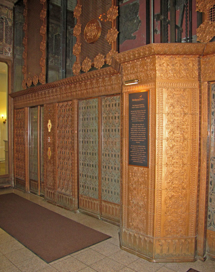
circulation core with four elevators, a mail slot, and staircase. No fire-stair
was provided or necessary. The internal portion of the “U” faces south so as to
collect light for the interior recesses of the building- light being a necessary
commodity to attract good tenants.
Sullivan spared nothing to accomplish this end for: “In order to increase the amount of light to the interior, the stairwell and the light slit facing the inner courtyard were lined with white glazed terra-cotta that was more costly than normal tiles.” (Frei 1992) The first and second floors are united both spatially and visually through additional staircases and the intention of retail occupation. Mechanical systems were relegated to the basement, including the motors for the elevators, boilers, and electrical “dynamos.” Entrances were provided on both Church and Pearl Streets. A concierge desk offered services to tenants and guests including mail delivery. Above the “base” of the building were a series of office floors of identical plan were placed. These floors featured private lavatories in reconfigurable office spaces.
The halls were defined by wood and glass partition walls, intended to give the interior a bright and “club” like feeling. The elevators and staircases were enclosed not by walls, but metal cages permitting southern light to penetrate through the circulatory systems and into the hallways. The only exception to the rise of offices was the seventh floor with lavatories and a barbershop, and the top floor with a US Weather Service Bureau office and spaces for building attendants.
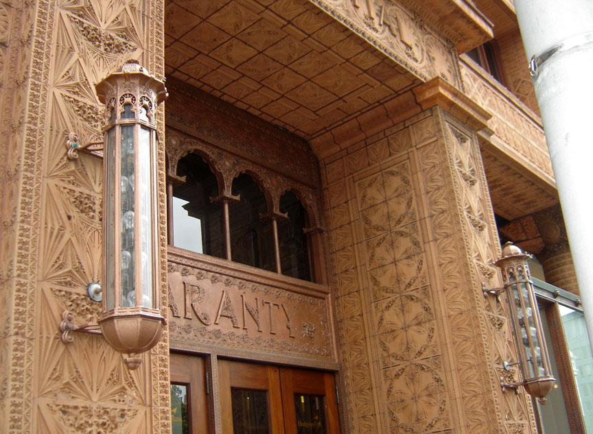
The most remarkable problem for those wishing to cast Sullivan exclusively in
the camp of proto-modernist designers is his steadfast and adroit insistence to
ornament his buildings. Ornament is one of the most defining characteristics of
the Guaranty as “The entire façade of this building is clothed in ornament, like
hieroglyphs on the columns and walls of temples in ancient Egypt.” Sullivan’s
ornament is unmistakably original, but it is not without precedents in the
contemporary tradition of the English Arts and Crafts movement. “The numerous
parallels between Sullivan’s ornament and the architectural decoration of
Furness make it clear that Sullivan’s ornament came directly from Furness and,
through him, from earlier ornament by English architects.” (Sprague 1979)
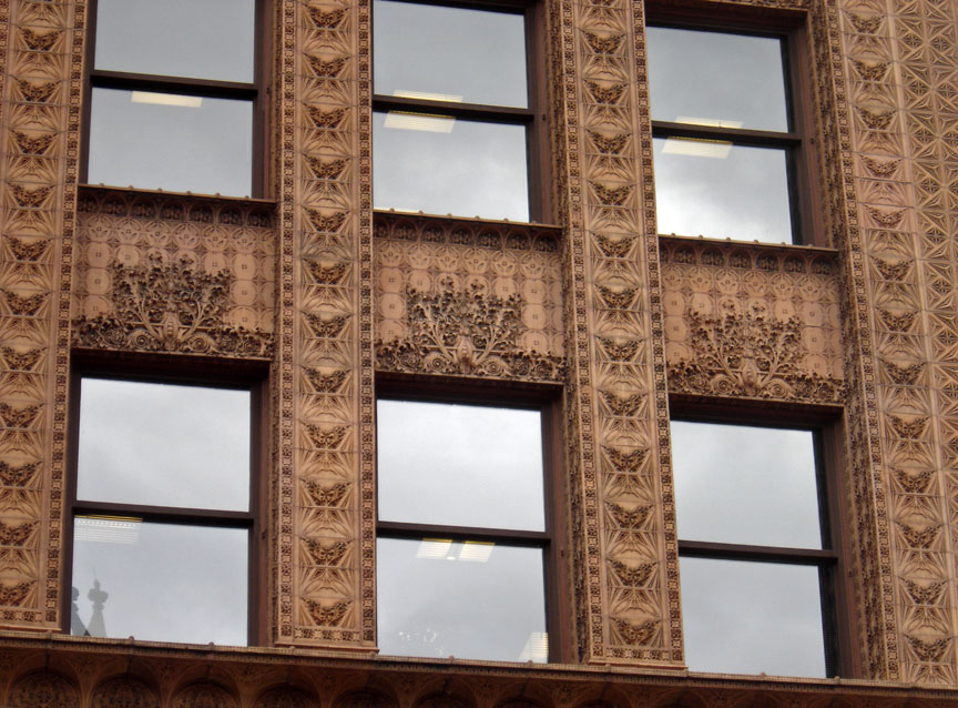
The context of his ornament is important as it was seen as a salient amenity for the attraction of tenants to his buildings. For all the “good taste” his ornament might project to the tenant of the 19th century, it situated his design within an anti-classicist categorization out of “good taste” in the 20th century. Ironically this change was precipitated by the World's Columbian Exposition where Sullivan was the only American to win a European design medal and the only American to offer non-classically inspired design. The Guaranty, for all its evocative general expression of tectonics is equally as evocative at the scale of its modular terracotta components. “Here the balance of interest between the individuals and the group to which they belong is precarious, and the sheer number of compositional elements makes it difficult to attend to the individually.” (Andrew 1985) It is difficult to determine whether the ornament serves to reinforce the building or the building reinforces the ornament.
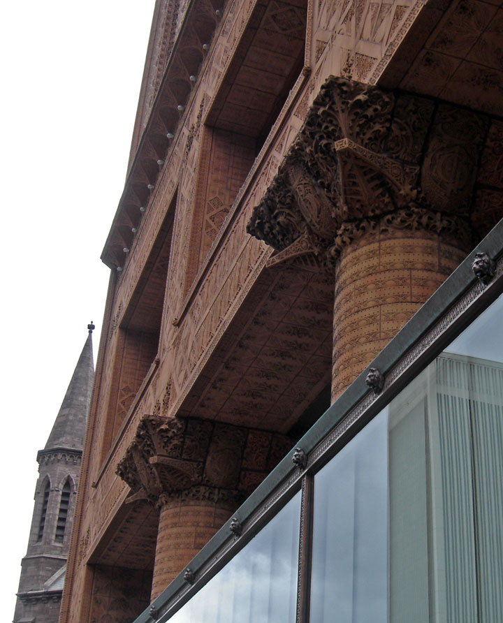
The experiential effect of so much pattern and repetitive design is homogeneity in tension with the expression of individual components. Unlike the Wainwright building, where ornament is more directly patterned on historical forms and where spandrels are self differentiated, the Guaranty is almost brutal in the hierarchical treatment of and expression within its terracotta relief. Such conforming treatment is at odds with the supposedly democratic naturalism Sullivan claims for the design. Especially near the base, ornamental patterns reflect the span and connection of underlying steel members. As the components rise, a rigid pattern is followed, story upon story until the cornice where the pattern explodes into an umbrageous tangle of leaves and vines, encapsulating the windows and reaching outward over the street below.
The ornament tells the same story as the theory which created it: bottom, middle, top- light steel skeleton within. The modulating ornament of the Guaranty also indicates the evolution of the medium for Sullivan as an artist. His initial explorations were inspired directly by contemporary work and historical precedent. Eventually his contact with Adler and work involving the “engineers aesthetic” led to more structurally expressive forms, and eventually to an art only his own, florid and organic. “From 1885 through 1889 Sullivan’s ornament lost much of its former angularity and became more sophisticated and luxuriant.” (Sprague 1979) It is perhaps due to Sullivan’s experiences at the Ecole des Beaux Arts that his ornaments as well as his building are given so much expressive and didactic energy.
“His evident haste in wanting to set down the architectural vision before it became blurred even in the slightest degree presumably derives from the method at the French school of working from, and staying as close as possible to, the esquisse.” (Sprague 1979) This is an idea he apparently held for designing ornamental elements as well. His sketch for a column capital at the Guaranty labeled “finis” indicates the level of development with which his draftsmen began work. While containing some specific information, the sketch indicates more a painterly composition than a design document. Curiously, the process of design used by Sullivan to create such innovation was precisely that which prevented him from evolving his conception of plan and section to something his “modern” successors would explore. “In embracing the French theories of plan and esquisse, Sullivan remained firmly wedded to his time and place. . . By insisting upon the preeminence of plan, he could hardly have begun to imagine buildings with the spatial complexity of a Wright or a Le Corbusier.” (Sprague 1979)
Text from Wikipedia
A brochure prepared by Harry B. Meyer of Hodgson Russ LLP
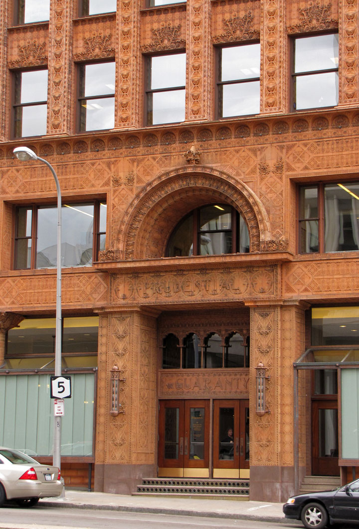
Terra Cotta Tile Detail
the Interior
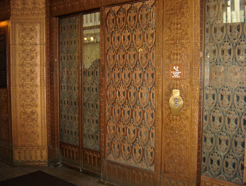
elevators
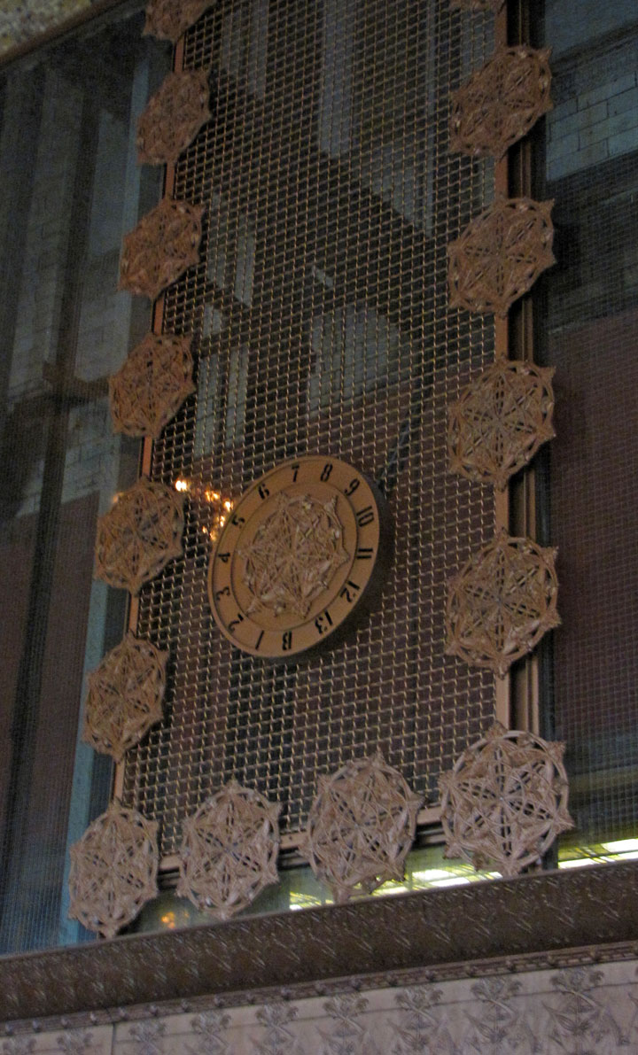
floor level indicator
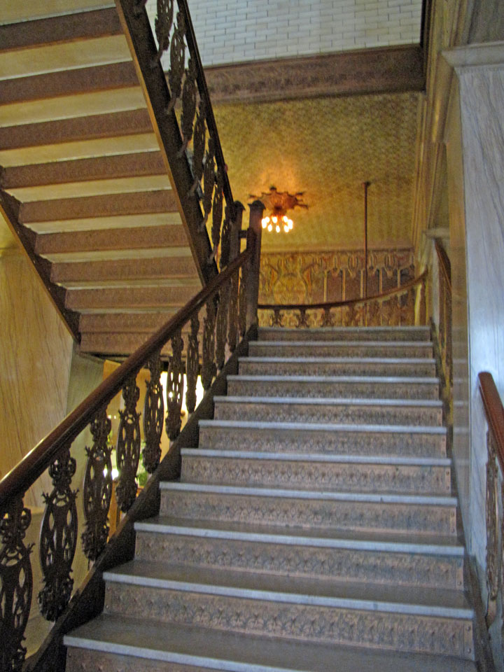
stairway
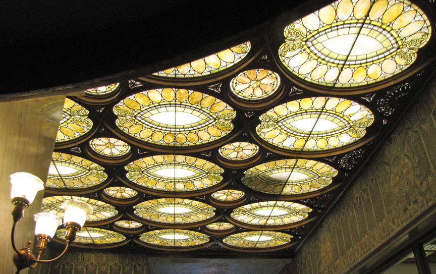
ceiling